Early on in my fine art career I had a personal experience that taught me to pay attention to the ways color emotionally affects the viewer. While assisting the judge of a local art show, as she scanned the entries and was noting potential award placement on the pieces she was judging, she told those of us assisting that she despised the color ‘orange’. What that meant was, any piece with orange in it would not likely place in this show.
That color, to her, superseded the success of the piece or the skill of the artist. There was nothing objective about her opinion of the color. It was strictly a subjective bias, and, therefore, emotional.
The funny thing is, I love orange! So, while this incident hasn’t kept me from using orange in my palette, it has made me more aware of the potential biases for – or against – the colors I choose to use in my work.
Color is key for everything in design. Those in the cutthroat profession of high-end marketing focus a great deal of strategy determining the precise hue that emotionally connects with their client’s branding. IBM’s blue. Cocoa-Cola’s red. Starbucks’ green. These logos are instantly recognized not only for the logo design but also the color.
The same is true for designers of clothing and interiors. For example, those ‘in the know’ introduce color trends each year, and those yearning to be noticed will fall in line so as not to be left behind. Knowing this, those working in all facets of design can be confident that color creates an emotional response with their audience.
So how does this help me as a creator? As I choose colors for the palette of my next project, I am thinking about their impact on the composition. While I do have background influences that affect my decisions, I will also choose colors for their emotional effect.
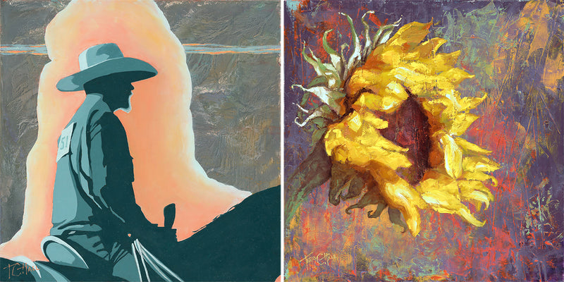
I recently completed two small works for a show with both pieces having decidedly different types of palettes. One artwork consisted primarily of medium to dark muted hues creating large areas of subdued tones, but included a highlighted area of lighter, contrasting colors. This created a mood that lit the subject, a figure, implying quiet solitude.
The palette of the other piece included hot colors dancing all over the surface, some slightly less intense than others, but all loosely applied over incredible textures created on the base of the panel. This piece, with its wild colors and textures, projected a highly energetic atmosphere. Each of these pieces will connect to those who are drawn to them for totally unique – and emotional – reasons.
Do you want to explore your own biases? Spend some time touring a favorite gallery or museum with the intent to pay close attention to the colors each artist used and note your reactions. Ask yourself (and I really mean ask) why you do - or don’t - like the colors that were used. What are you genuinely feeling about them? Often, you’ll find yourself having an instinctive reaction to colors that might surprise you and might also help with understanding why you are magnetically drawn to some works more than others.
As you stroll through a gallery or gift shop or browse through online stores to consider art purchases, use this knowledge to guide you toward filling your walls with colors that connect to your emotions, no matter the subject. You’ll find it helps you create a cohesive atmosphere that lifts your spirits and puts a smile on your space.

0 comments