"Think about this: Color evokes emotion. Without color our world would be gray and dull."
“Pop of Color”… I find myself chuckling sometimes when I see this phrase used in an Instagram post, and the only “pop” I see is a very grayed-down blue or green, or other reference to a subtle hue. I don’t mean to be rude, but that’s not a pop.
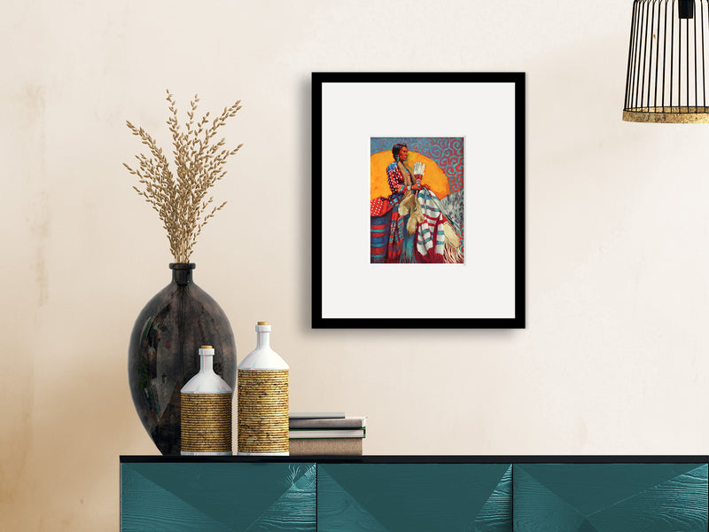
As an artist, “Pop of Color” means exactly that – it pops out at you. It makes you look. And you may even look again, just because it pulls you in. The eye is supposed to travel and absorb the color (or texture, or value) ‘magnets’ designed throughout the piece. The concept of color in a piece is to steer the viewer throughout the piece by using these magnets.
Or think about this: Color evokes emotion. Without color our world would be gray and dull. There would be no “felicitous” reaction from the viewer. What would we have to look forward to if the sun wasn’t a golden yellow as it disappeared on the horizon? How would we feel if all birds were gray or white or black? What if the ocean was always a steel gray #3? Or if a field of poppies were a battleship gray #5? And butterflies?...
My apologies if you’re colorblind. I’m sure you can relate to my questions.
Final thought: Imagine seeing a field of snow blanketed over everything, but off to the left one lone red tulip has popped through the vast white canvas. Would it catch your attention? My guess is it would. And that, folks, is a Pop of Color!

0 comments